In today’s dynamic world, putting forward data in an understandable way can pose a significant challenge for many. With unending numbers and complex statistics, leveraging tools to deliver these numbers in a comprehensive and visually appealing package becomes essential. In this vein, one such tool that’s been making waves in the field of data visualization is the donut chart. In this article, we delve deep into the world of donut charts and understand what makes them a preferred choice for many professionals across sectors.
Unmasking the Donut Chart: A Stellar Tool for Data Visualization
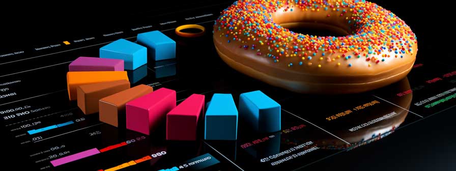
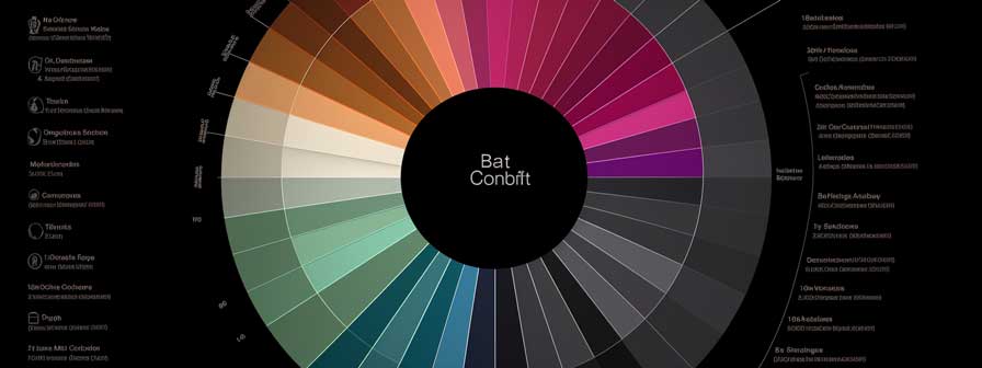
A donut chart is a hollow circular chart that leverages arcs to display their data. Think of a pie chart but with an area in the middle that can be used for additional data or simply for aesthetic purposes.
The donut chart is referred to as such due to its similarity to a donut and offers an exciting alternative to the tried and tested pie chart. The chart is divided into sectors, each representing a portion of the whole.
The intriguing part is that every segment’s arc length is proportional to the value it represents, thus providing a visually comprehensive representation of data. In comparison to other data visualization tools, it effectively allows comparisons and trends to be easily recognized and understood.
Its popularity in the data visualization field could be attributed to its simplified design, which allows for easy interpretation of data while highlighting the important parts. The purpose of the donut chart is to create an immediate impression, simplifying the information processing and enhancing the possibility of data recall.
Bringing Life to Numbers: Key Features of Donut Charts
The donut chart stands out for various reasons: its unique design. Its center offers a space for additional information, which can be numerical or textual. If you have more than one data series, you can create multiple rings offering quite a visual spectacle.
Interestingly, donut charts can also be animated. Animations can make comparisons, display changes over time, or attract the viewer’s attention to specific data points. This adds an essential layer of user engagement to the charts.
Lastly, donut charts are highly adaptable. They can be used in different contexts, whether in a presentation, a report, or an interactive dashboard, delivering complex data easily and simply.
Delving Deeper: Case Studies To Demonstrate Donut Charts Utility
Case studies often help validate a tool’s efficiency with concrete examples. For instance, an educational institution could employ a donut chart to display the distribution of different disciplines among its students. They can use different colors for each discipline, making the data visually appealing and easier to understand.
A company could utilize a donut chart to represent its revenue breakdown in the corporate world. The different segments could display the various income streams, making it easy to distinguish, compare, and comprehend.
Moreover, a donut chart in the public health sector could illustrate the prevalence of different diseases in a region. The size of each segment could signify the extent of the disease and its impact, helping in directly communicating critical numbers to the public.
Donut Charts vs. Others: A Comparative Analysis
While pie charts have been around for ages, the donut chart is relatively new to the game. While both have their merits, the latter excels in terms of aesthetics. Thanks to the inner circle, donut chart is deemed more visually engaging and capable of displaying more complex data points.
Compared to bar and line graphs, donut charts provide a more immediate visual comparison between categories. Its 360-degree layout allows the viewer to grasp the concept or presented data instantly. The versatile donut chart stands out with its visual appeal and ability to bring complex data to life. Its comparative strengths over other chart types, coupled with wide-ranging applications, make it a powerful tool in the data visualization sphere.